I’ve resisted using custom color schemes for a long time—not because they aren’t helpful, but because when I’m teaching, I want my user interface to match what my customers see. Eventually, though, I decided it was time to tailor the environment to something that works better for me day-to-day.
Why Use a Custom Color Scheme?
Autodesk® Inventor®’s default color schemes are perfectly functional, but depending on your workflow, lighting, or visual preferences, customizing your environment can make a surprising difference in clarity and comfort, especially when sketching or presenting.
My Preferred Settings
Here are the options I typically use:
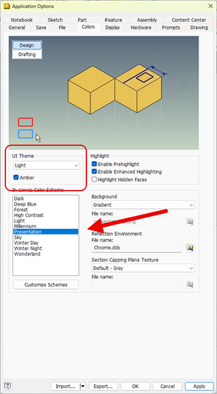
- UI Theme: Light
- Amber Option: On
- (Available only for the Light UI Theme. I prefer it because it helps Ribbon buttons pop visually.)
- In-Canvas Color Scheme: Presentation
- Background: Gradient
This setup works well with my office environment—lighter walls, plenty of lighting—and keeps the interface easy on my eyes. While the Amber highlight doesn’t carry over into palettes, that’s a trade-off I can live with.
Addressing Sketch Visibility Issues
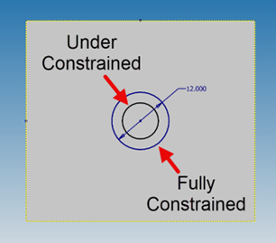
In the Sketch environment, some of Inventor’s stock color schemes make it difficult to distinguish between constrained and under-constrained geometry. Horizontal and vertical constraint trace lines can also be tough to see when teaching or presenting.
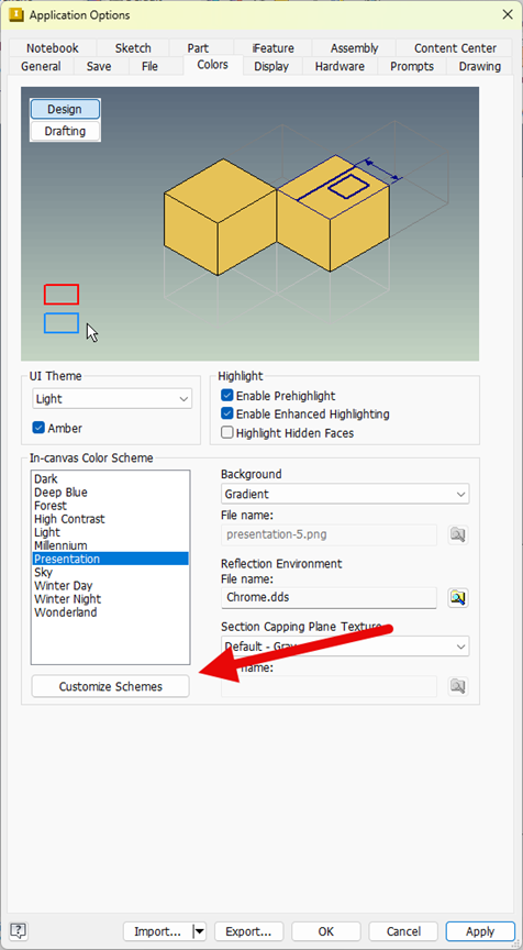
To fix that, I created a copy of the Presentation color scheme and made a series of adjustments:

- Enhanced Constrained Geometry Color
I slightly enriched the blue used for constrained geometry, making it more visible and easier to teach from.
- Increased Line Thickness
Both Thin and Thick line weights were increased for better trace visibility, especially important when demonstrating constraint behavior.

- Adjusted the Background Tone
I shifted the overall background toward a slightly “bluer” appearance to improve contrast and visibility without creating eye strain.

Before and After
The result is an interface that’s cleaner, easier to read, and far more effective for demonstrating Sketch workflows in Inventor. The improvements are subtle but meaningful, especially when working long hours or presenting to a classroom.
Before:

After:
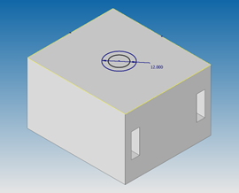
Customizing your Inventor color scheme is a simple change that can dramatically improve visibility, teaching clarity, and overall user comfort. Small adjustments—like modifying line thickness, enriching constraint colors, or choosing a background that reduces eye strain—can make your daily design experience noticeably better.
If you're looking for help optimizing your Inventor environment or want expert guidance on improving your workflows, Hagerman & Company is here to help.
Contact us to learn more or schedule time with our technical experts.


Comments